
A Definite Claim to Beauty: Morris and his Influence on Book Design
William Morris was not the first Western printer to lament the decline in quality caused by industrial book production, but he was among the most forceful in articulating a clear vision for the ideal handmade book. His essays on book design emphasized the importance of form and quality, embodied in clear, closely-spaced type, well-proportioned margins, fine paper, and a balance between text and ornamentation. Paramount to Morris was the idea of the book as a work of art produced through the individual efforts of multiple craftsmen. Many aspiring printers looked to this vision as a guide.
Morris and the Kelmscott Press exercised a major influence on the resurgence of fine printing and a renewed emphasis on quality design. His model of printing small quantities of beautiful books using traditional techniques, while maintaining total control over design and production, found many emulators. Some private presses, such as the Roycroft and Essex House presses, imitated Morris's distinctive neo-gothic, arts and crafts style. Others, including commercial printers, built on Morris's vision for the ideal book as the basis for new styles. In keeping with his insistence on balance between text and ornament, good design, and the use of quality materials, many associated with books and printing continue to acknowledge their debt to William Morris.
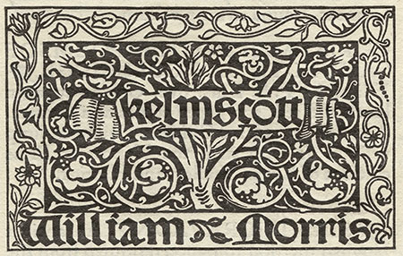
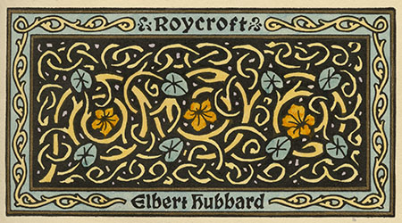
Images: William Morris' Kelmscott Press printer's mark and Elbert Hubbard's Roycroft Press printer's mark.
"There was so much difference between the anemic type and presswork of the eighties and the Kelmscott style that Morris's work came like a breath of northwest wind into a murky and humid atmosphere."
- Carl Purlington Rollins, Morris's Typographical Adventure, 1958 -
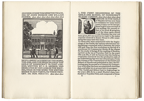
An Endeavour Towards the Teaching of John Ruskin and William Morris
by C. R. Ashbee. Typeface designed by C.R. Ashbee
London: Edward Arnold, 1901
Printing at the Essex House Press embodied Morris's teachings about labor and design. Founded by C. R. Ashbee in 1898, Essex House was part of the Guild of Handicraft, an Arts and Crafts association dedicated to providing fulfilling work for its craftsmen and laborers. Ashbee employed workers and equipment transferred from the Kelmscott Press after it shut down in 1898. An Endeavor was printed using one of the original Kelmscott hand presses.
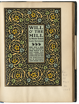
Will 'O the Mill
by Robert Louis Stevenson
East Aurora, NY: Roycroft Shop, 1901
Not all attempts to follow in the footsteps of William Morris were successful. Elbert Hubbard's Roycroft Press was based in an artists' colony in upstate New York, and Hubbard's talent for self-promotion made the Roycrofters an important exponent of the Arts and Crafts movement in the United States. Many book artists and historians view Hubbard's work as a pale imitation of Morris's. May Morris once referred to Hubbard as "that obnoxious imitator of my dear father."
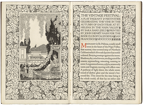
A Play Pageant; Festivities Celebrating the Vintage Festival
by Sara Bard Field
San Francisco: Printed by John Henry Nash for the Book Club of California, 1920
A strong tradition of fine printing began in California at the turn of the 20th century as Morris's ideas about book design spread. The American printer John Henry Nash applied Morris's concept of balance between text and ornamentation in this two-page title opening. Though Morris often chose to print classic works, Nash covered a lighter topic: the annual autumn grape harvest in the Napa Valley. In recognition of one of his greatest influences, Nash reportedly had a portrait made of Morris for his San Francisco office.
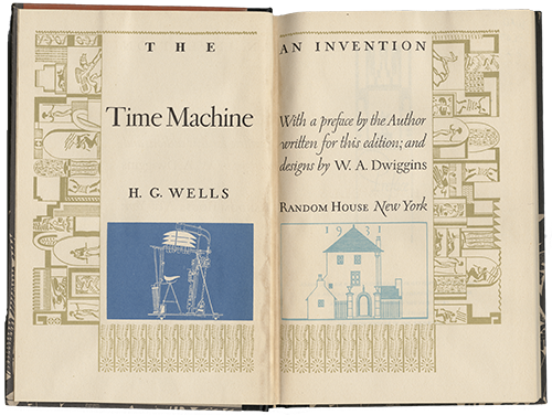
The Time Machine
by H. G. Wells. Designed by W. A. Dwiggins
New York: Random House, 1931
W. A. Dwiggins was a 20th-century trade book designer, calligrapher and type designer who applied many of Morris's principles to commercial book publishing. With a background in arts and crafts design and commercial advertising, Dwiggins utilized modern production techniques while remaining faithful to Morris's vision of a well-designed book. The proportional margins and two-page unified design are especially notable in this edition of The Time Machine.
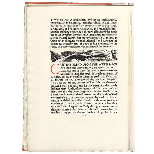
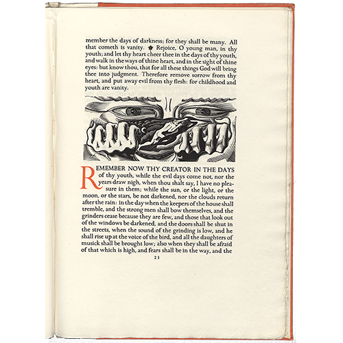
Ecclesiastes, or The Preacher
Engravings by Eric Gill
London: Golden Cockerel Press, 1934
The Golden Cockerel Press was known for the quality of its arts and crafts-inspired experimental typefaces and fine woodcut illustrations. Some of its most famous books included typefaces and illustrations by Eric Gill, whose often erotic images were a source of controversy among book enthusiasts during the early 20th century.