
Developing the Project
11/15/18 - Ben Jackson
The Modern Songs of War And Conflict exhibit is an ongoing project aimed at using the affordances of the digital medium to explore the ways in which popular music has responded to and been shaped by the major armed conflicts of the United States. The materials for the exhibit are a part of the Keesing Collection on Popular Music and Culture, part of the Special Collections in Performing Arts at the University of Maryland, College Park. This collection and the research associated with it was developed over decades by Dr. Hugo Keesing with the centerpiece, a comprehensive Vietnam War discography, being undertaken with Wouter Keesing, C.L. Yarbrough, and Justin Brummer. In the collection on Music and the Vietnam War there is a mammoth amount of material including:
- Over 6,000 recordings dealing with the war
- Annotated discographies grouping songs by subject
- Photographs and label scans of recordings
- Research materials and notes
- ephemera and realia including magazines, buttons, stickers, and gum cards
and much more. The real question in developing this project became how best to make this corpus accessible and usable for the largest number of people.
One major goal in the design of this project was to be sure the visitor was actively engaging with the site rather than being saddled solely with flat blocks of text. While there are certainly excellent reasons for choosing a minimalist design for this project interactivity was chosen as an imperfect but effective approach to user-engagement. As a web design novice, my ideas for interactive content often outstretched my ability. However, as the open source community continues to expand resources for education and inspiration abound. Before going over some specific tools used in this project I will say that Free Code Camp and Codepen have been invaluable resources. The former is an incredibly useful non-profit resource for learning techniques and reference while the latter is an excellent platform for building out pages and learning from other designers.
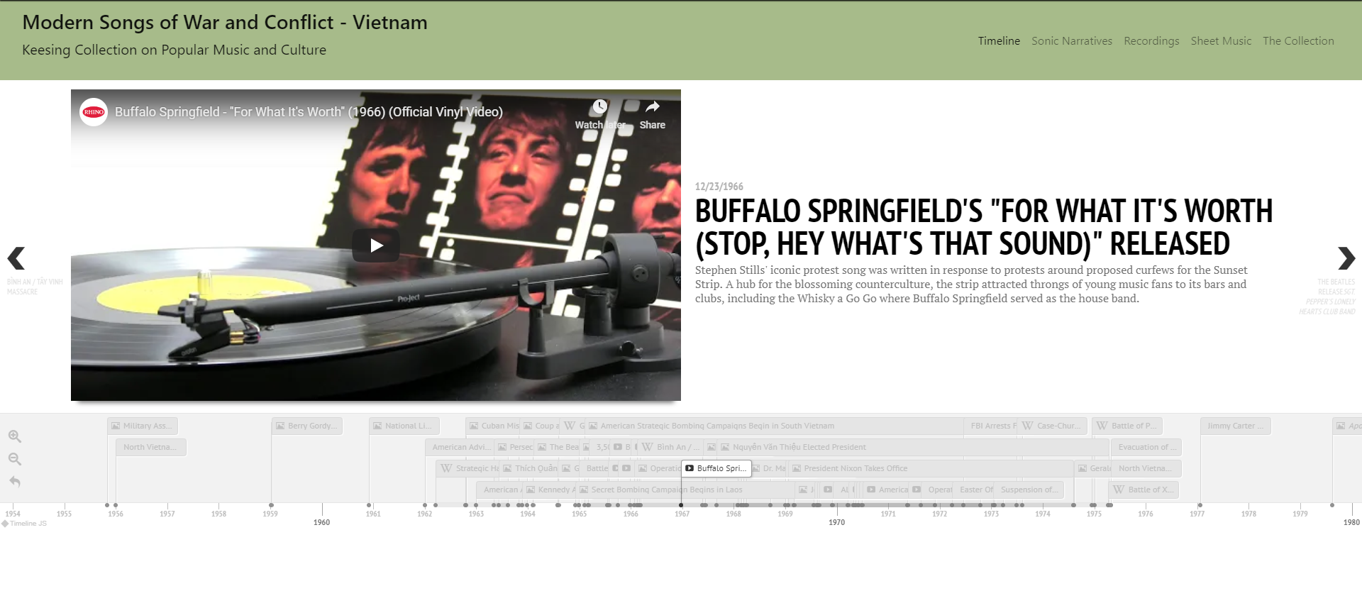
When it came to building out content pages for this collection, what I had in abundance more than anything was research materials and a fairly sizable database of recordings. So I decided that interactive graphics would be the most effective way to bring out the stories present in the data. The two tools I used the most in accomplishing this are the JavaScript plug-ins TimelineJS by Knight Lab and Google Charts. TimelineJS is a plug-in that produces a beautifully rendered scrolling timeline with embedded images, videos, and links, all edited through Google Sheets. Google Charts is a plug-in that will draw smart-looking minimalist graphs that can include individualized entry-by-entry commentary as a mouse hovers over each bringing out latent narratives in a large set of information. With minimal knowledge of HTML and JS any designer can easily use both of these to produce engaging graphics that can give new life to archival materials online.
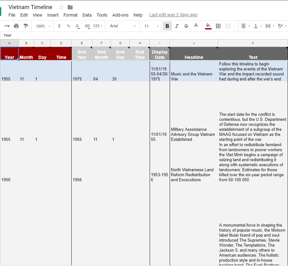
For those looking to put a sequence of events in greater context, one would be hard-pressed to find an easier way to do so than TimelineJS. To build out the timeline, the designer simply heads to Knight Lab's documentation page, downloads the Google Sheets Template fills in their relevant material and then copies the sheet back into Knightlab's page and there you have it:
Google charts, a more robust and interactive version of the charts available from Google Sheets, requires a bit more direct work in JS but given its ease of use and Google's extensive documentation is still a very approachable way to make interactive graphics. For an example of these graphs in action, read through the analysis of the pop charts and the war and hover over the chart to see how information comes up for each entry, or take a look at one of the pages exploring recordings in this collection by topic. For the recordings sub-pages I chose a timeline because the database of recordings had already been partially tagged by subject grouping recordings by topics such as Agent Orange, P.O.W.s and Kent State. With the timeline graph from Google Charts I was able to show in one graph how the subject factored into popular song over time, and given the commentary features, a user can hover over each entry to see complete information on the recordings.
One critical issue that comes up with producing these graphics or graphs of any kind though is accessibility. Depending on the graph and the work that the designer puts in screen-readers can read a brief description, or worst-case nothing at all. The World Wide Web Consortium provides best-practices for dealing with complex images on a site, but with increasingly-popular interactive graphs, there are new advances that need to be made in terms of accessibility. To do some work to make this information usable, for each graph in the sites the user is also directed to a plain table containing all data in the graph. However, this still does not completely contextualize the information the graph provides, which is why I attempted to provide clear description of the trends with each graph.
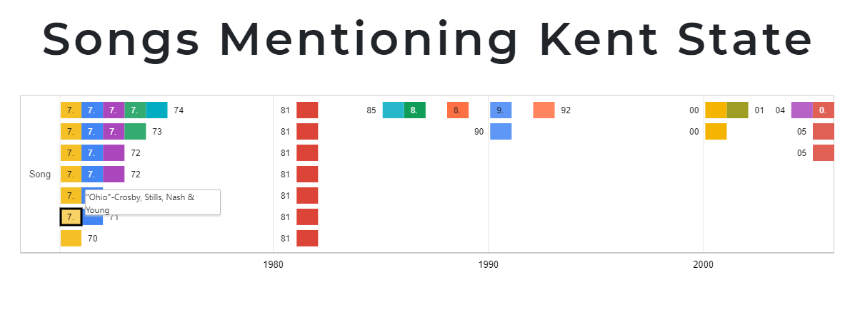
For creating the graphs, Google's documentation pages provide ample guidance and sample script that can be copied to begin making a graph. The one change I often incorporated was creating a dummy string of entries so that I could enter tooltips (the information seen on hover) for each entry:
dataTable.addColumn({ type: 'string', id: 'Song' });

dataTable.addColumn({ type: 'string', id: 'year label' });

dataTable.addColumn({ type: 'string', role: 'tooltip' });

dataTable.addColumn({ type: 'date', id: 'Start' });

dataTable.addColumn({ type: 'date', id: 'End' });

dataTable.addRows([ [ 'Song', '71', '"41,000 Plus 4 (Ballad Of The Kent State Massacre)"-Ruth Warwick', new Date(1971, 1, 1), new Date(1971, 12, 31) ],
As this is a living project, the look and functionality of it will continue to change over time. However, as the open-source community continues to develop accessible tools such as those mentioned above it will only become easier to make archival materials available and engaging for a wider range of people.