Book Art and the Kelmscott Press
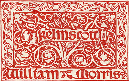
Morris transformed his life-long interest in book design into action after attending a lecture on printing in 1888 by his neighbor, Emery Walker. For Morris, the books of his time were symptomatic of the shortcomings of modern society: they were ugly, badly made and mass-produced. His vision for the Kelmscott Press grew out of an admiration for the design and traditional craftsmanship of manuscripts from the Middle Ages and early printed books. As a result, the books of the Kelmscott Press seemed at once both antiquarian in appearance and an embodiment of the Arts and Crafts aesthetic Morris championed through his designs.
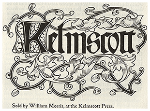
Image: Kelmscott Press printer's mark, Epistola de Contemptu Mundi, 1894.
A Note by William Morris on His Aims in Founding the Kelmscott Press.
by William Morris
Hammersmith: Kelmscott Press, 1898
William Morris set forth his principles of book design in his essay A Note by William Morris on His Aims in Founding the Kelmscott Press. These principles were rooted in the example of the printers and scribes of the middle ages. Based on the techniques of his medieval counterparts, Morris's principles of book design emphasized quality materials and thoughtful layout. Morris insisted on using handmade paper produced in London, as well as ink imported from Germany. For Morris it was crucial that the decorative elements on a page complement the printed words.
Type
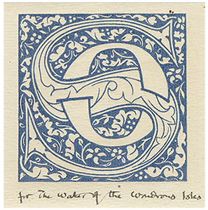
Morris created three types for use in his Kelmscott Press books:
- Golden - a Roman type based on those of 15th-century Venetian printers.
- Troy - a Gothic type created for The Recuyell of the Historyes of Troy.
- Chaucer - a smaller version of the Troy created for the Kelmscott Chaucer.
Spacing
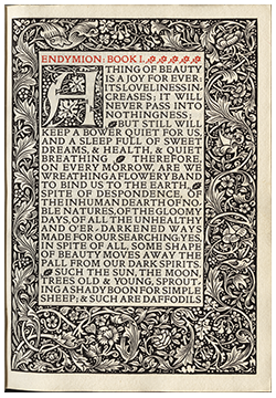
Morris's type was designed to avoid an abundance of white space between letters which in his opinion formed "those ugly rivers on lines running about the page which are such a blemish to decent printing." According to Morris, lateral spaces between words should be no more than necessary and should be as nearly equal as possible. ~ A Note by William Morris
This should always leave the inner margin the narrowest, the top somewhat wider, the outside (fore-edge) wider still, and the bottom widest of all. This rule is never departed from in medieval books, written or printed.
~ A Note by William Morris on page layout ~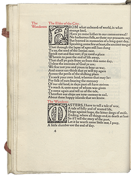
Paper
The handmade paper used in Kelmscott Press books, made by Joseph Batchelor and Son in Kent, was based on a 15th century Italian paper. This paper was made solely from linen rags, and without bleaching chemicals. Various watermarks were used for different sizes of paper produced: flower (16" X 11" and 16" X 22"), perch (17" X 23"), and apple (18" X 13").
Ink
Morris wanted a very black ink made without modern chemicals. He obtained the ink from manufacturer Gebrüder Jänecke in Hanover, Germany.
It was only natural that I, a decorator by profession, should attempt to ornament my books suitably: about this matter I will only say that I have always tried to keep in mind the necessity for making my decoration a part of the page of type.
~ A Note by William Morris on decoration ~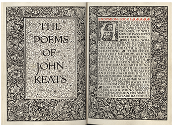
Design Unit
Morris considered the double page opening, as opposed to the single page, the basic unit of design. He believed the two pages should complement each other.
